

The Unreadable Bible
How the modern Bible is not designed for reading
Imagine this: a friend excitedly tells you about a novel she’s discovered.

It’s called ‘Pride and Prejudice’, and she can’t stop talking about it. It’s the most enthralling, witty drama she’s ever read!
After your friend leaves, you think to yourself, ‘I’d like to see for myself why she’s so excited about this book.’ So you find a copy of Pride and Prejudice and open it to the first page.
You probably expect it to look something like this:
Would you be more, or less keen to read it if it looked like this instead?
Every ‘normal’ modern Bible is formatted like a reference book.
Pause for a moment. Can you think of 5 pros and 5 cons of the way we format ‘normal’ Bibles?
The elements of a reference Bible
 Help you find parts of the Bible quickly
 Break the flow of the text, often ignoring the literary sections of the books Make the Bible look like a collection of short articles Tell your brain you’ve reached a stopping point, even if the author would have disagreed Allow you to refer to a precise part of the Bible Encourage you to ignore genre and read the Bible as a collection of isolated spiritual statements Contribute to a cluttered reading experience Useful when searching for a specific part of a passage you’ve previously read Ruin the suspense, and rob readers of the chance to interpret for themselves Interrupt the natural flow of the text Encourage you to treat the Bible as short episodes Are sometimes misleading Can provide helpful context which may not be obvious from the text Useful if you’re trying to understand precise textual nuances Interrupt your reading experience—you have to shift your eye to the bottom of the page, then find your place again Contribute to a cluttered reading experience Less whitespace = less paper = cheaper Bibles Pages look ugly and cluttered Reading feels more stressful and overwhelming
It doesn’t have to be this way
A reference Bible can be great for reference purposes. But the design of most Bibles gets in the way of just enjoying reading the Bible.
So what can you do about it?
One simple solution is to get yourself a reader’s Bible. That is, a Bible without the columns, tiny fonts and distracting additions.
If you’re introducing a friend to the Bible, get them a reader’s Bible too. Otherwise you’ll need to work hard to help them overcome the challenges that come with a reference format. (If you really can’t find a reader’s Bible in a translation that will make sense to them, The Field Guide to the Bible might help them to not find the Bible so daunting.)
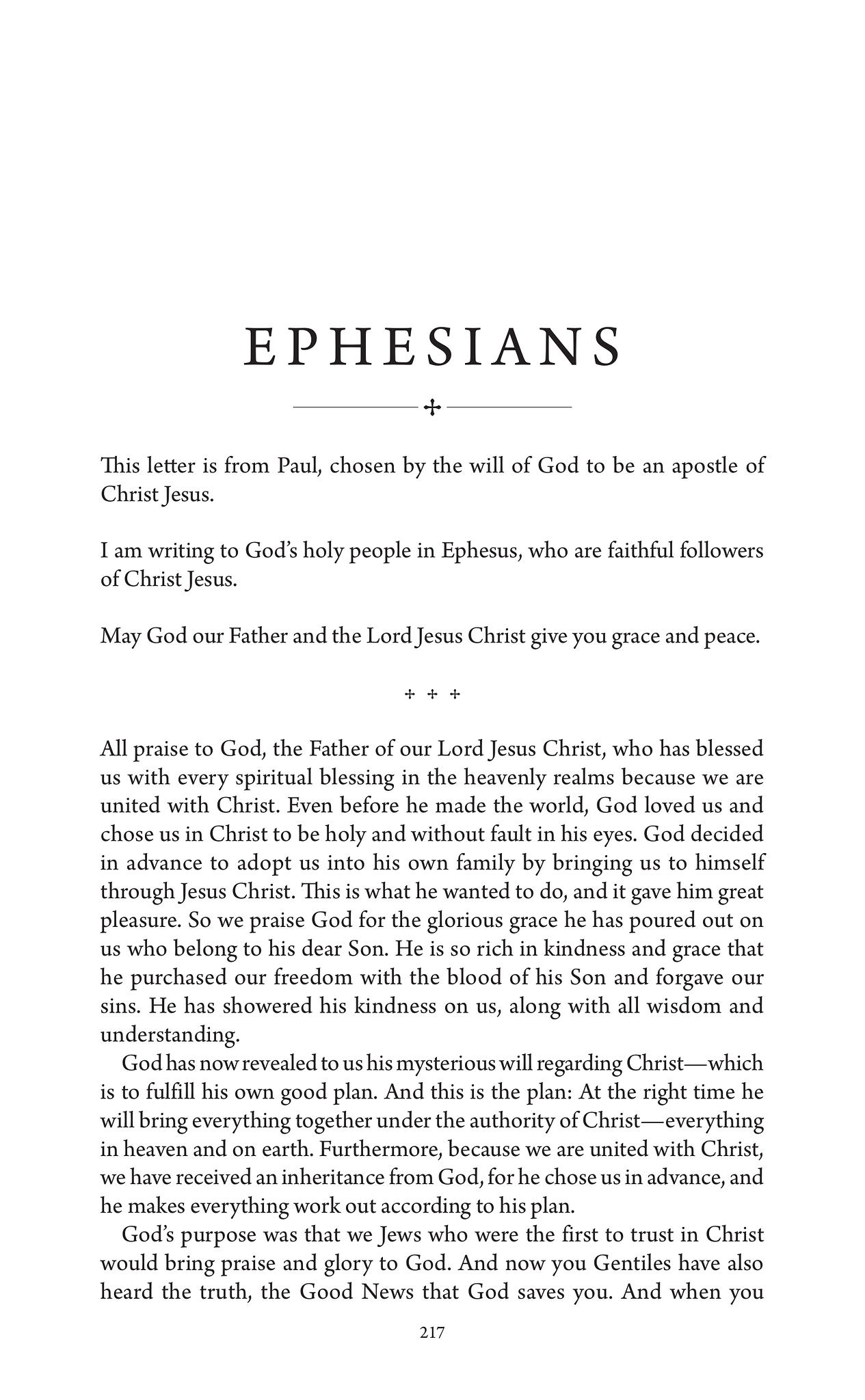
When choosing a reader’s Bible, look for an edition that communicates the genre and natural flow of the text through the page design. Poetry should look like poetry, letters should look like letters and narrative should look like narrative.
For example, here’s the start of Ephesians in Immerse: the Reading Bible.
You won’t realise how much difference a reader’s Bible makes until you try one.